Yoku Moku Style Design System (DESIGN.md, Japanese UI)
设计规范
Design approach: A premium Western confectionery brand founded in 1969. Known for Cigare au Chocolat. A three-layer composition combining a dual-font system of Mincho (Yu Mincho) headings + Gothic (YuGothic) body text with Assistant (Google Fonts) for Latin sub-headings. Centered on deep navy #002063, with a warm cream-white #f9f8f2 background, expressing the quality and trustworthiness befitting a gift brand - Density: A relaxed product-showcase style. Large visuals and generous whitespace convey the appeal of the products, with purchase paths placed discreetly. While functioning as an EC sit
会员专享
会员专享
升级会员解锁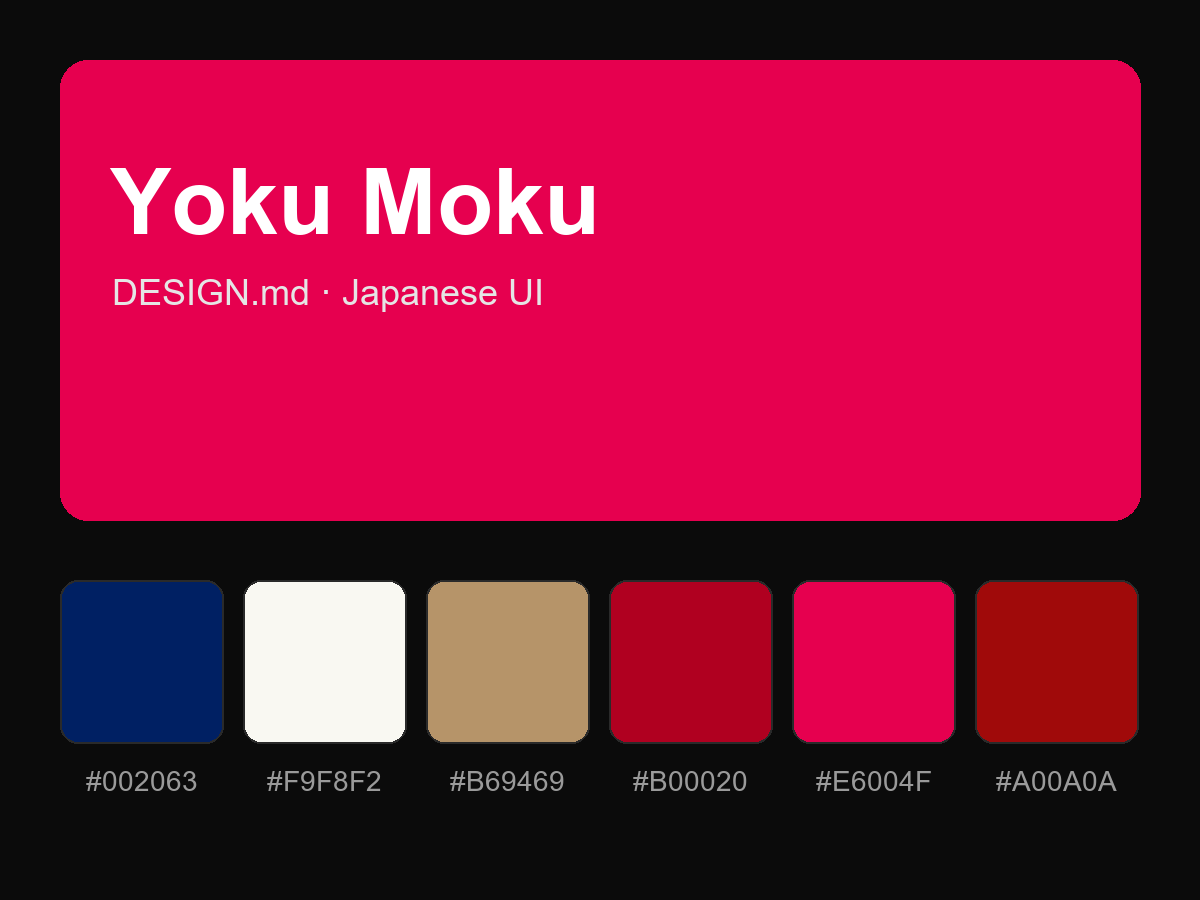
购买后即可查看完整提示词