TOPPAN (TOPPAN Holdings) Style Design System (DESIGN.md, Japanese UI)
设计规范
Design philosophy: Expressing the precision and authority of a printing company founded in 1900 through fully square buttons (radius 0px) and the in-house typeface "Toppan Bunkyu Gothic". Clean, waste-free, industrial beauty - Density: Body text is small at 13–14px. Headings are bold in English Roboto Bold (64px), while Japanese text is restrained (18–25px). Information hierarchy is created through the contrast between English and Japanese - Keywords: Printing precision, square buttons, blue authority, in-house typeface, bilingual typography - Characteristics: - Full adoption of the in-house t
会员专享
会员专享
升级会员解锁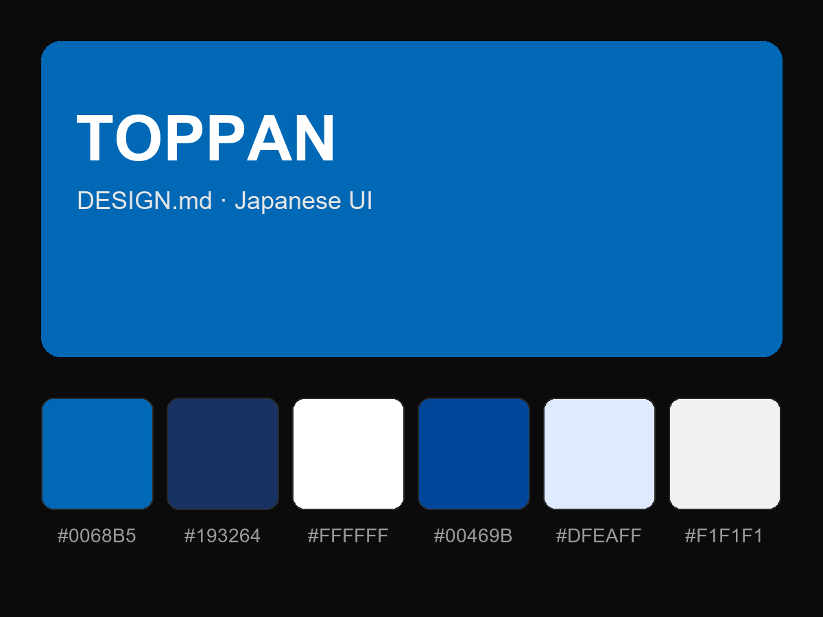
购买后即可查看完整提示词