SOU・SOU Style Design System (DESIGN.md, Japanese UI)
设计规范
Design policy: A highly unusual choice — using off-white #f5f5f5 like washi paper as the canvas, and setting both body text and headings entirely in Noto Serif JP (a Mincho typeface). The accent mustard #c1a443 (golden brown) evokes traditional dyed colors and tea rooms, creating a contemporary reconstruction of Japanese editorial design - Density: Product cards and body text are generously spaced, with letter-spacing opened extremely wide at 0.08em (body) to 0.2em (h2). A slow-breathing, relaxed Japanese-style editorial composition - Keywords: Noto Serif JP, Mincho body, large letter-spacing,
会员专享
会员专享
升级会员解锁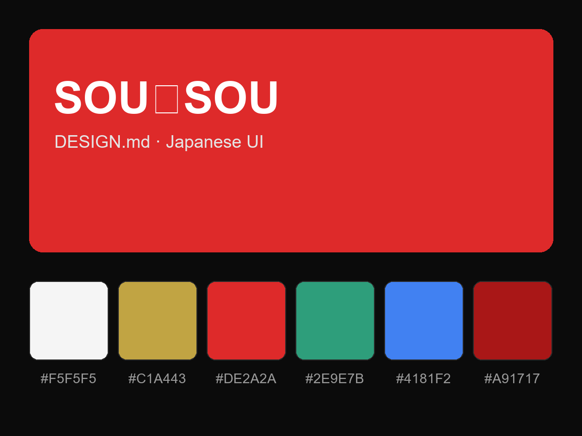
购买后即可查看完整提示词