ROHTO Pharmaceutical (ROHTO) Style Design System (DESIGN.md, Japanese UI)
设计规范
Design policy: Compose with only white ground plus brand blue surfaces and borders. Photos are shown as horizontal cards, and the UI uses rounded corners (8–10px) and pills to create softness - About ROHTO Pharmaceutical: A major player in OTC drugs and skincare, but the corporate site is not product-focused — the corporate pathways of "Business, Research, Sustainability, IR, Recruiting" take the lead. Only the handwritten key message "Open your heart" carries emotion - Density: Medium density, corporate type. Main visual → News (tab switching) → PickUP → Card sections → Group colleagues → SNS
会员专享
会员专享
升级会员解锁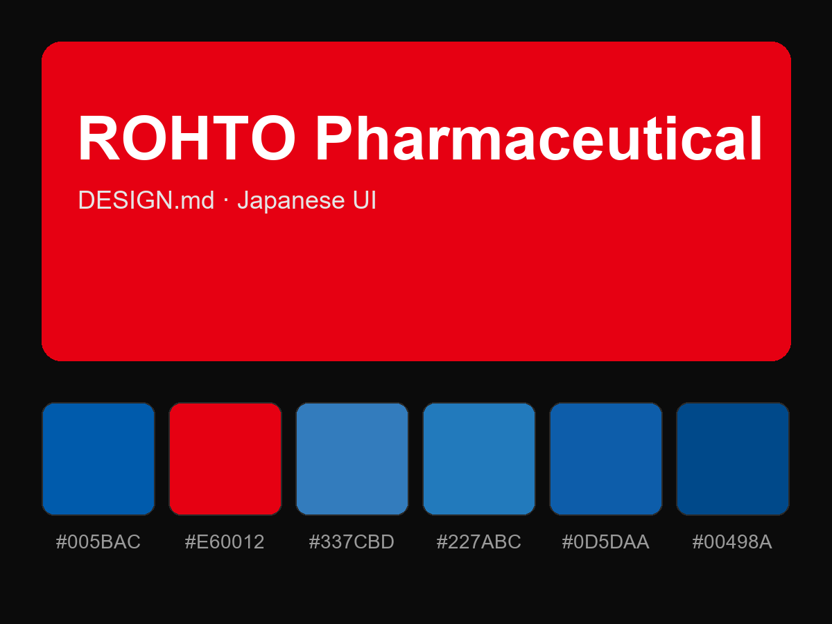
购买后即可查看完整提示词