PRESS BUTTER SAND Style Design System (DESIGN.md, Japanese UI)
设计规范
Design approach: A Western-style confectionery brand from Tokyo. As a butter sandwich specialty shop, it achieves a dramatic visual design that balances the premium feel of its ingredients with boldness. It combines the traditional Japanese serif style of Tsukushi A Old Mincho (Fontworks) with the geometric Western sans-serif of Futura LT Pro, expressing a refined Japanese-Western fusion. The brand color #ff3300 (orange-red) is a vivid accent that evokes the heat of "freshly baked" - Density: Full-screen hero images and a relaxed section structure. A cinematic layout that presents the beauty o
会员专享
会员专享
升级会员解锁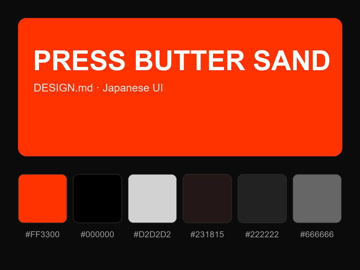
购买后即可查看完整提示词