NTT docomo Style Design System (DESIGN.md, Japanese UI)
设计规范
Design policy: A trustworthy corporate site built around docomo Red. Card-based UI and soft rounded corners create a friendly feel. A layered structure that floats white cards on a light gray background - Density: High information volume, but organized through cards. Body text uses line-height: 1.5 for standard readability - Keywords: Corporate, red identity, card-based UI, soft rounded corners, friendliness - Characteristics: docomo Red #cc0033 is used consistently in the header, button borders, and accents. Roboto is partially used for Latin text. Overall, shadowed cards create the visual hi
会员专享
会员专享
升级会员解锁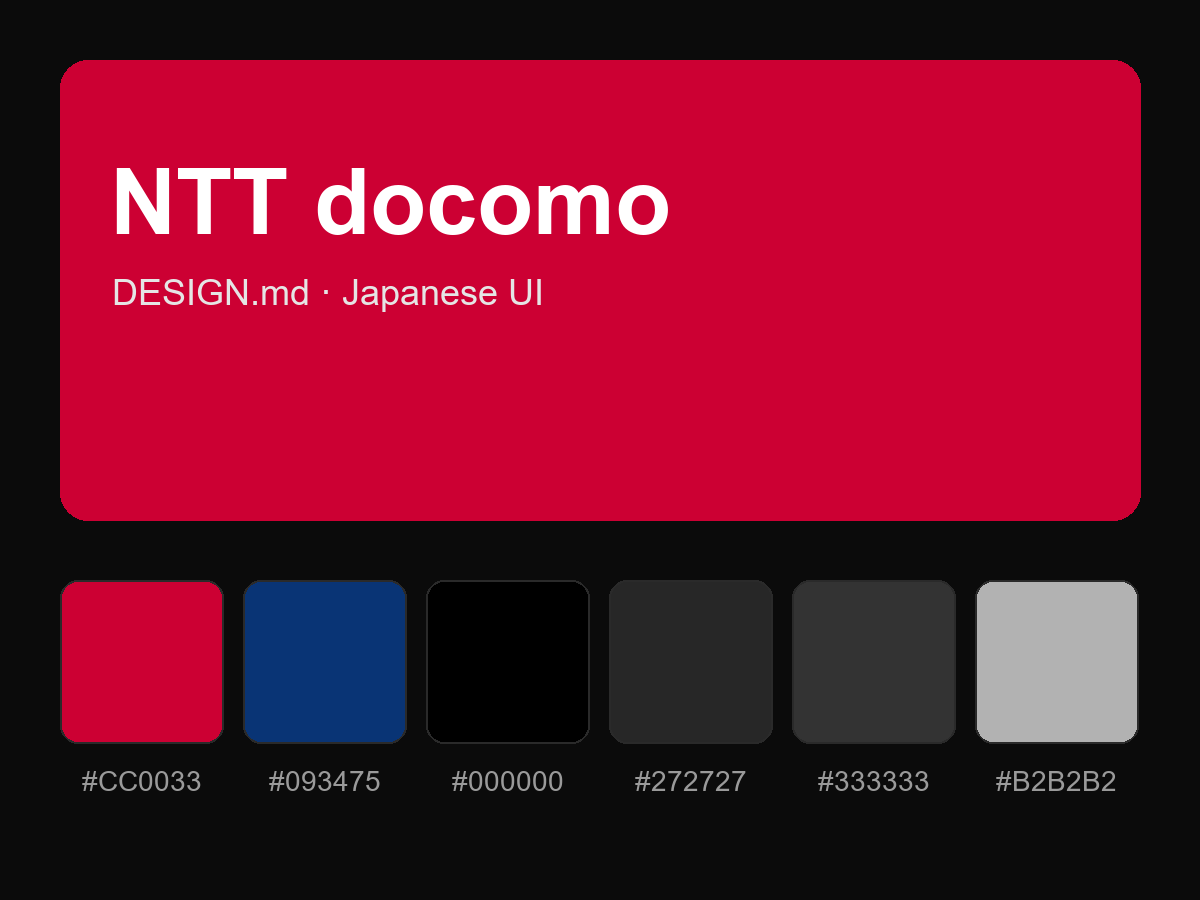
购买后即可查看完整提示词