Nissin (Nissin Foods Group) Style Design System (DESIGN.md, Japanese UI)
设计规范
Design approach: A dark-toned, immersive food brand site. Boldly showcases CM videos and product photography, delivering a media-first experience. Strong contrast with white text and red accents on a dark charcoal background - Density: Relaxed, large-visual-centric. Generous whitespace between sections, with product and video content as the star - Keywords: Dark, bold, immersive, media-first, premium food - Characteristics: Uses TypeSquare's "Aoto Gothic" custom font. Page background is #1a1a1a (dark charcoal), not pure black, giving it a slight warmth. Brand red #ff0000 is used as an accent
会员专享
会员专享
升级会员解锁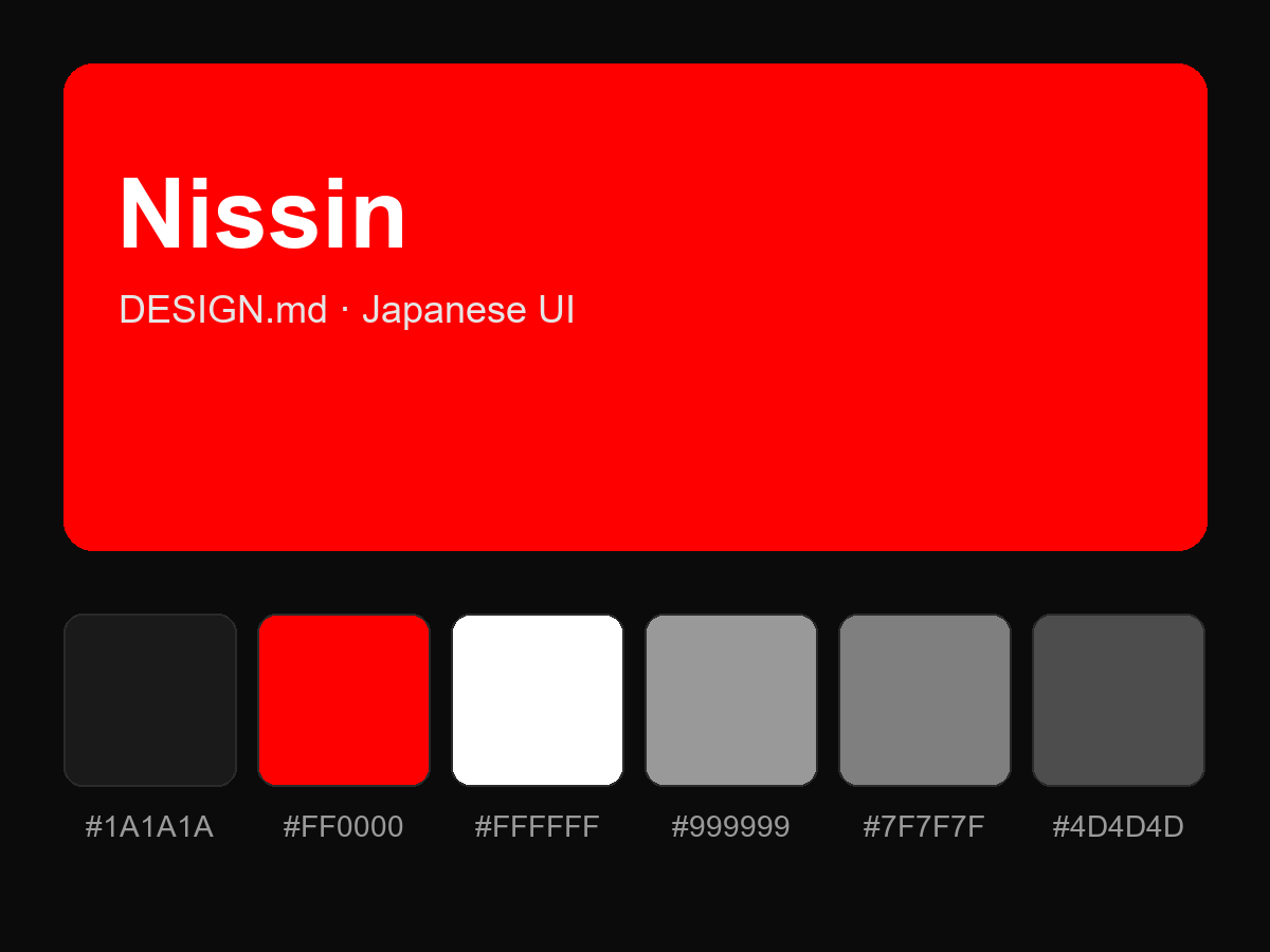
购买后即可查看完整提示词