KIRIN Style Design System (DESIGN.md, Japanese UI)
设计规范
Design policy: The corporate site of a beverage manufacturer representative of Japan. KIRIN Red (#f00000) is deployed across the board, expressing warmth and approachability through pill-shaped buttons and a warm cream background. A corporate site that maintains a clean, modern impression despite being an information-dense product portal - Density: Portal-type with a content-first approach. Product information, campaigns, columns, IR information, etc. are arranged in multiple layers. Rhythm is created by switching background colors per section - Keywords: KIRIN Red, pill CTA, Roboto-first, war
会员专享
会员专享
升级会员解锁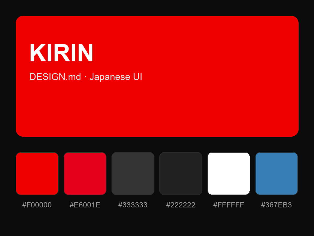
购买后即可查看完整提示词