Gyokusendo Style Design System (DESIGN.md, Japanese UI)
设计规范
Design policy: A single Mincho typeface, quietly, thinly. No Gothic whatsoever; the entire site is set in a Mincho-style display typeface. The larger the heading, the thinner (weight 300), and line spacing is 2.0 throughout. The quietness of the act of "striking" copperware is expressed through the whitespace of the letterforms - About Gyokusendo: A workshop of hammered copperware that has continued for 200 years. Rather than e-commerce, the focus is on introducing the experience of "visiting the workshop" and "using and nurturing" the pieces, and the site's copy is built around short poetic l
会员专享
会员专享
升级会员解锁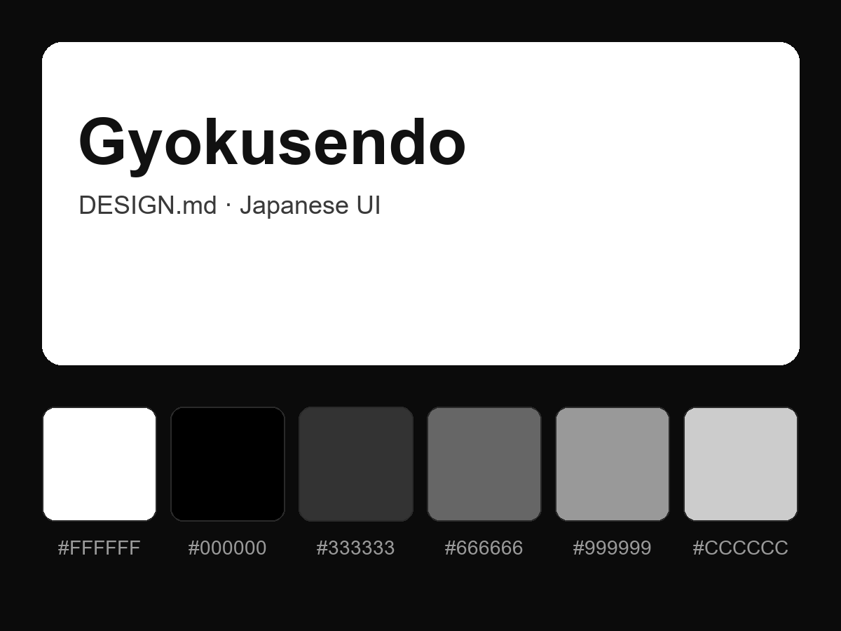
购买后即可查看完整提示词