Casa BRUTUS Style Design System (DESIGN.md, Japanese UI)
设计规范
Design approach: Sharp contrast between a pure white background #ffffff and pure black text #000000. Built on a Helvetica Neue + Hiragino Kaku Gothic ProN Latin-first stack, creating the neutral, flat worldview unique to magazines - Density: Relatively high information density. A magazine-grid layout that arranges architecture, design, and lifestyle article thumbnails as bold, large-format images - Keywords: Pure white + jet black, normal letter-spacing, square CTA (border-radius 0px), Helvetica Neue Latin-first, Hiragino ProN (note: ProN, not Pro), line-height 1.5, magazine-style typography -
会员专享
会员专享
升级会员解锁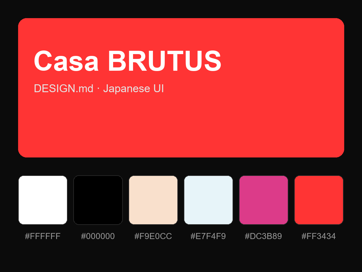
购买后即可查看完整提示词