Asahi Beer Style Design System (DESIGN.md, Japanese UI)
设计规范
Design approach: A corporate site for a major beverage manufacturer that balances cleanliness and energy. Centered on brand blue, with gold/yellow accents standing out in product promotions - Density: A product-portal style with a high volume of information. A grid layout where product cards and campaign banners are lined up - Keywords: Refreshing, approachable, corporate, clean, promotion-focused - Characteristics: A two-color scheme with brand blue #074194 applied as solid fill on navigation and footer, and #ffd742 (gold yellow) used heavily on product badges. No font-feature-settings used;
会员专享
会员专享
升级会员解锁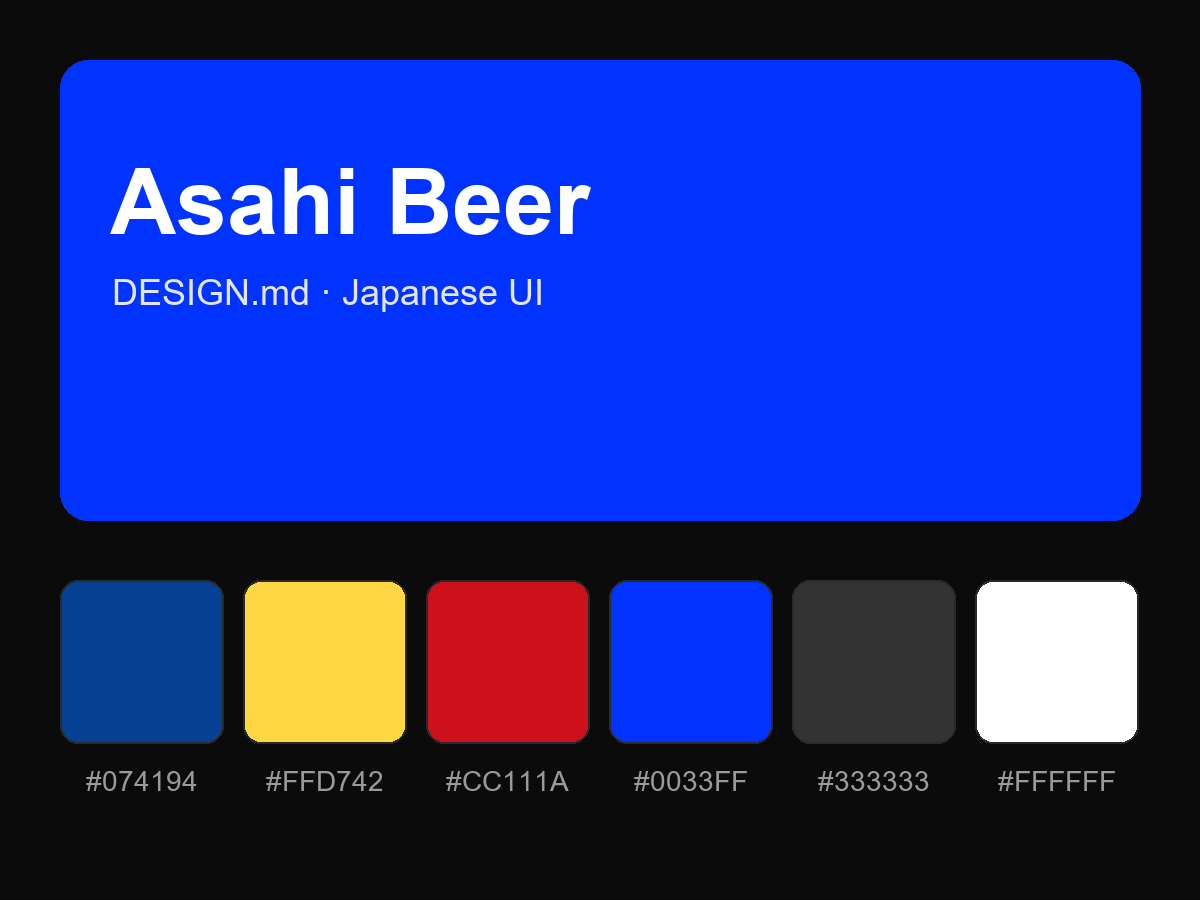
购买后即可查看完整提示词