10X (TenX) Style Design System (DESIGN.md, Japanese UI)
设计规范
Design approach: A clean, minimal corporate design that places very bold Japanese headings large on a white background. The backbone is a two-typeface system: Noto Sans JP for Japanese text, and Lexend for English labels, buttons, and numerals. Generous whitespace, with pale grey dot/stipple illustrations for a light feel - About 10X: A SaaS company transforming retail operations with technology. BtoB, but not stiff — it balances strength and readability through large headings × wide line spacing. The hero is a 96px ultra-bold heading - Density: Low to medium density. One message per section,
会员专享
会员专享
升级会员解锁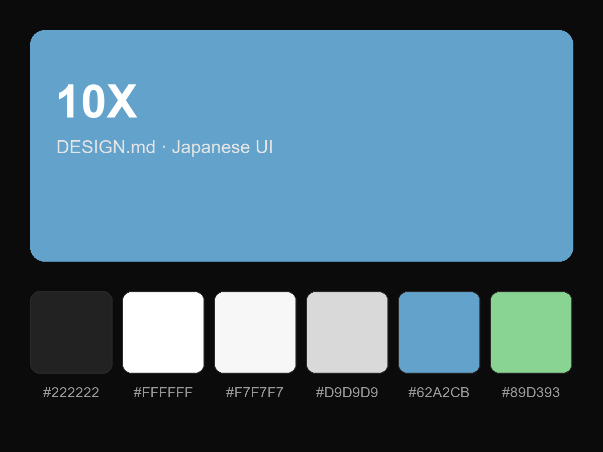
购买后即可查看完整提示词