TOPPAN (TOPPAN Holdings) Style Design System (DESIGN.md, Japanese UI)
Design System
Design philosophy: Expressing the precision and authority of a printing company founded in 1900 through fully square buttons (radius 0px) and the in-house typeface "Toppan Bunkyu Gothic". Clean, waste-free, industrial beauty - Density: Body text is small at 13–14px. Headings are bold in English Roboto Bold (64px), while Japanese text is restrained (18–25px). Information hierarchy is created through the contrast between English and Japanese - Keywords: Printing precision, square buttons, blue authority, in-house typeface, bilingual typography - Characteristics: - Full adoption of the in-house t
Members only
Members only
Upgrade to unlock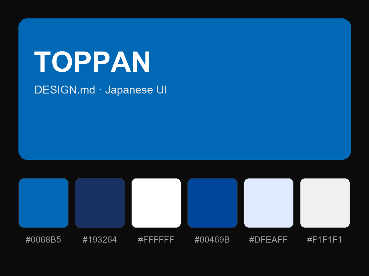
Purchase to reveal the full prompt