SEGA Style Design System (DESIGN.md, Japanese UI)
Design System
Design approach: A clean, trustworthy corporate site. Centered on news distribution and IR information. A strong color identity built around SEGA Blue - Density: Generous whitespace. Body text uses line-height: 2.0 with a focus on readability - Keywords: Corporate, clean, blue identity, news media, trust - Characteristics: Multiple blue shades are used distinctly, each with a clear color role for its purpose. A dual-axis font structure: Oswald for Latin display text, Noto Sans JP for Japanese text
Members only
Members only
Upgrade to unlock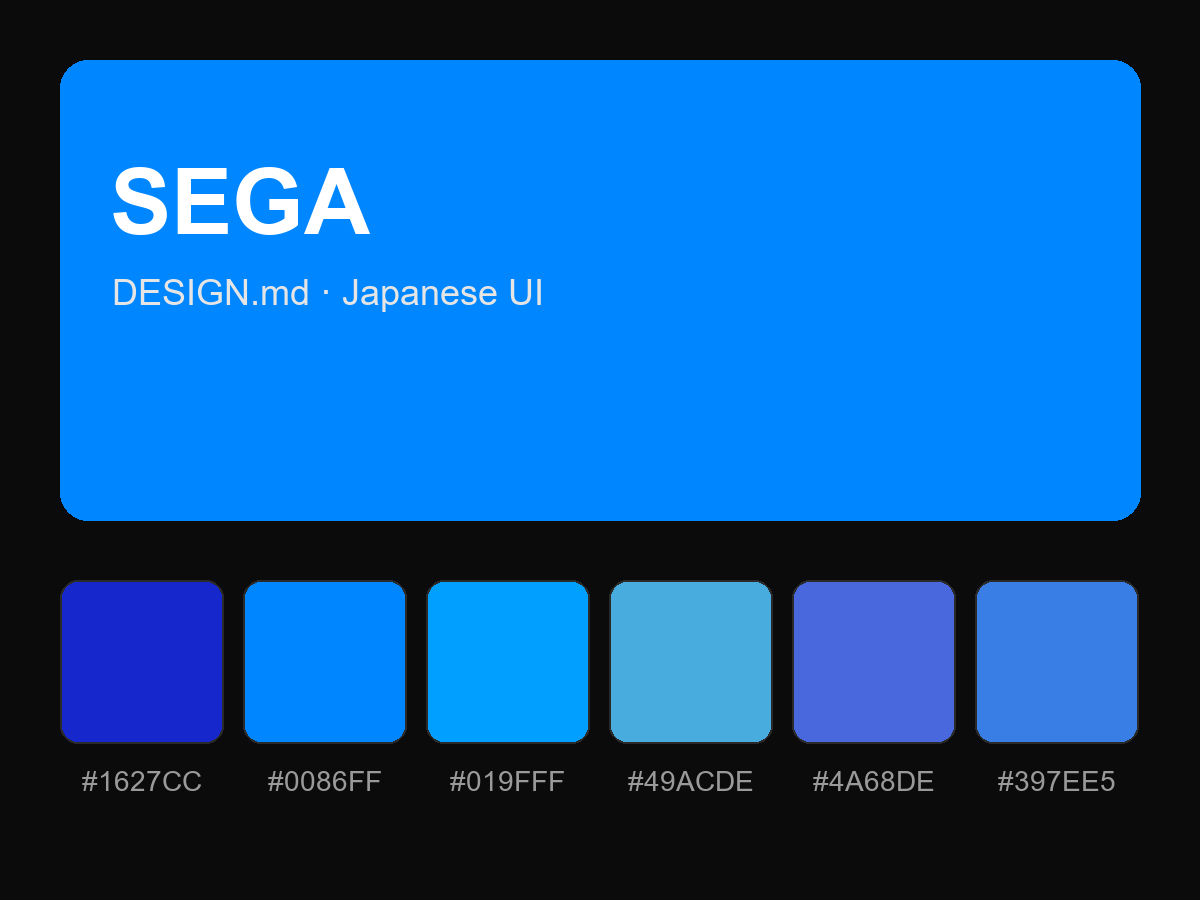
Purchase to reveal the full prompt