NTT docomo Style Design System (DESIGN.md, Japanese UI)
Design System
Design policy: A trustworthy corporate site built around docomo Red. Card-based UI and soft rounded corners create a friendly feel. A layered structure that floats white cards on a light gray background - Density: High information volume, but organized through cards. Body text uses line-height: 1.5 for standard readability - Keywords: Corporate, red identity, card-based UI, soft rounded corners, friendliness - Characteristics: docomo Red #cc0033 is used consistently in the header, button borders, and accents. Roboto is partially used for Latin text. Overall, shadowed cards create the visual hi
Members only
Members only
Upgrade to unlock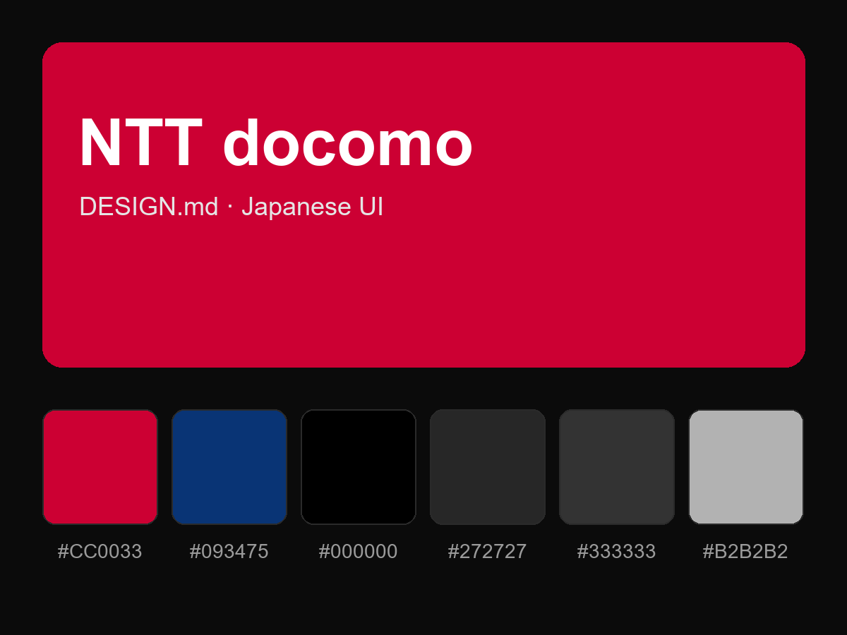
Purchase to reveal the full prompt