Kikkoman Style Design System (DESIGN.md, Japanese UI)
Design System
Design policy: A warm food-brand site. Centered on recipes and meal plans, with a homey and approachable design. The orange brand color stimulates the appetite, while cream-colored surfaces create a sense of warmth - Density: The corporate top page is information-dense (news, brand sites, and recipe entry points arranged in parallel), while recipe pages use a relaxed, card-centric structure - Keywords: warm, homey, approachable, recipe-centric, joy of food - Characteristics: The brand orange #e96600 is used consistently for header CTAs, search, tabs, and recipe headings, forming a sense of uni
Members only
Members only
Upgrade to unlock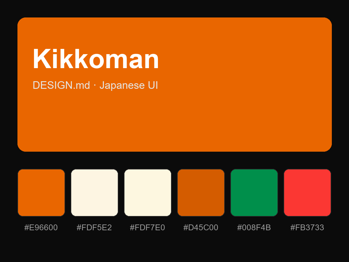
Purchase to reveal the full prompt