au by KDDI Style Design System (DESIGN.md, Japanese UI)
Design System
Design policy: A clean, consumer-oriented design that balances the trustworthiness of a telecommunications carrier with approachability. The brand color orange is concentrated on CTAs, while body text uses restrained grays to ensure readability - Density: A portal-style layout with a high volume of information, but with ample whitespace per section and clear visual guidance. Heavy use of card-style UI - Keywords: Trustworthy, clean, approachable, consumer-friendly, orange accent - Characteristics: Pure black (#000000) is not used; instead, a two-tier dark color scheme of #1b1b1b (headings) and
Members only
Members only
Upgrade to unlock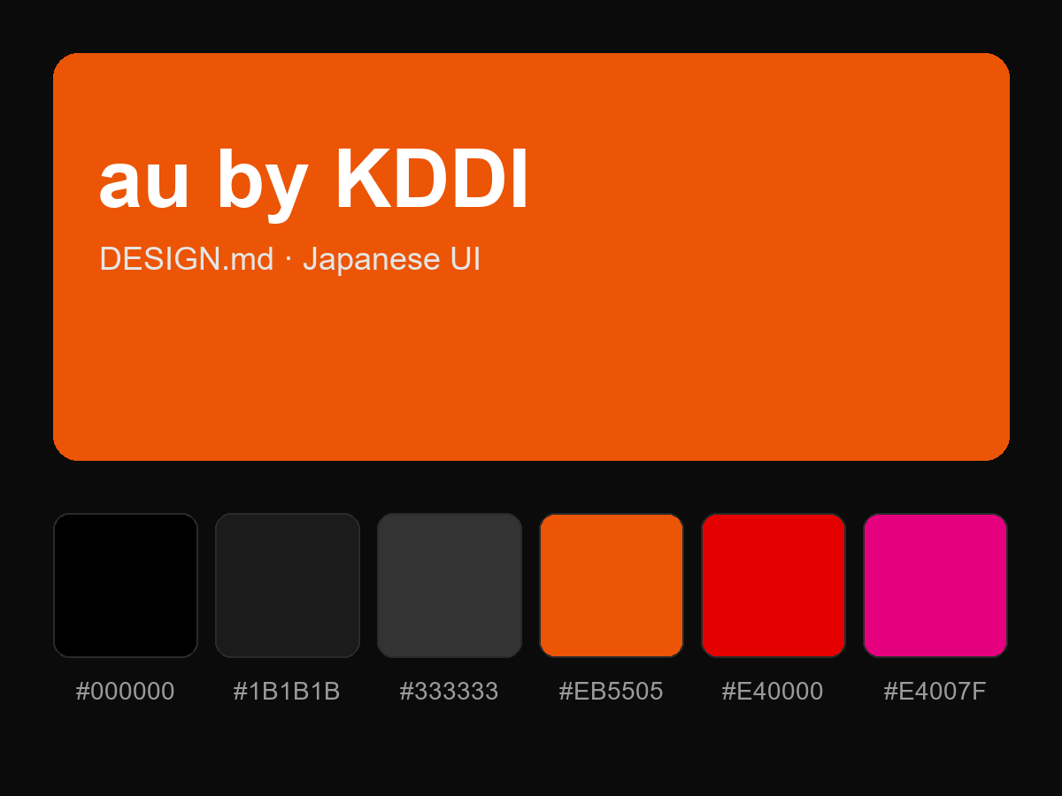
Purchase to reveal the full prompt