Apple Japan Style Design System (DESIGN.md, Japanese UI)
Design System
Design approach: The same minimal design as Apple global. A magazine layout that makes the product the star, composed with typography and whitespace - Density: Very spacious. Large hero images and headings spread across the full screen - Keywords: Minimal, premium, product-centric, black-and-white base, bold typography - Characteristics of the Japanese version: Apple's proprietary Japanese font SF Pro JP is used with highest priority. It is placed before the English version's SF Pro Display / SF Pro Text
Members only
Members only
Upgrade to unlock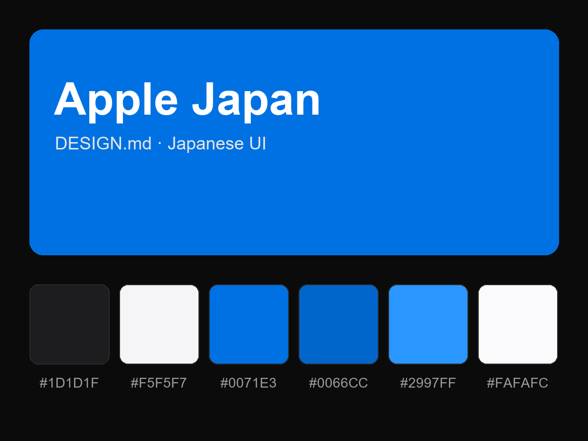
Purchase to reveal the full prompt