amadana Style Design System (DESIGN.md, Japanese UI)
Design System
Design approach: A dark-toned site like a gallery that "exhibits" products. Dark sections are layered over a white body background to make product photography stand out - Density: Medium. Product cards are arranged in a Shopify grid layout, while sections are separated by a large 16rem (256px) margin, giving it an exhibition-style feel - Keywords: Industrial minimal, gallery curation, dark-mode exhibition, red accent, single font - Characteristics: A stoic configuration with only one font, Noto Sans Japanese, and only weight 400. Hierarchy is created solely through size differences. CTAs are a
Members only
Members only
Upgrade to unlock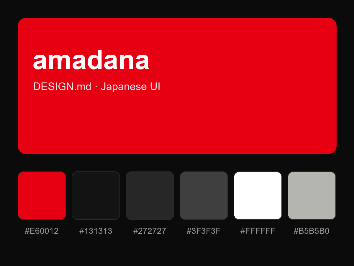
Purchase to reveal the full prompt