AJINOMOTO Style Design System (DESIGN.md, Japanese UI)
Design System
Design policy: The corporate site of a comprehensive food manufacturer representing Japan. Ajinomoto Red (#e60012) is deployed across the board as the brand color, and pill-shaped nav buttons paired with a clean white background achieve both a sense of trust and approachability. As a leading company in "food and health," it features a clean information architecture - Density: A corporate portal type encompassing product information, corporate information, sustainability, and recipes. Rhythm is created by switching the background color per section (white / light pink #ffefee / gray #f8f8f8) - K
Members only
Members only
Upgrade to unlock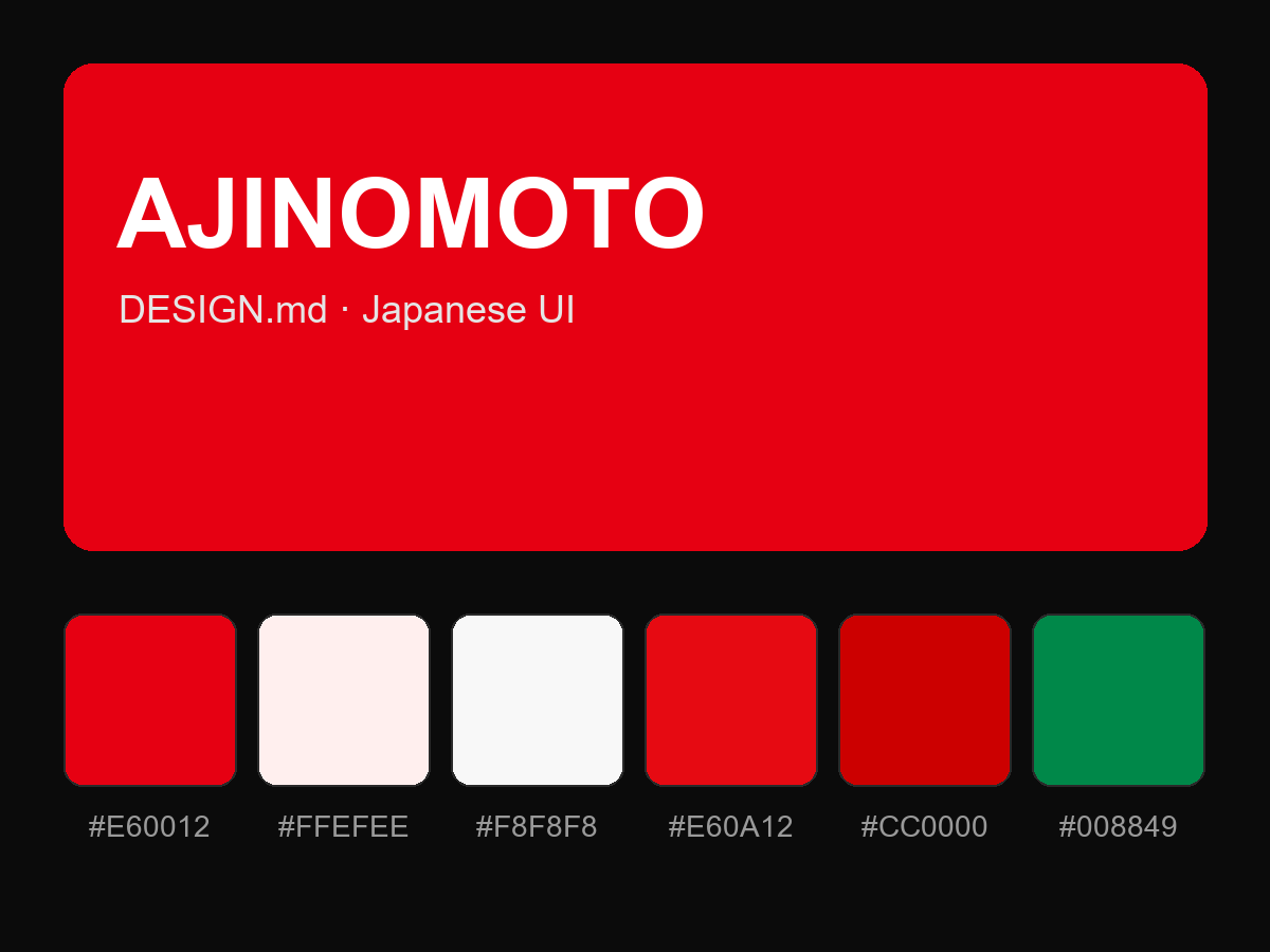
Purchase to reveal the full prompt