Pocari Sweat Style Design System (DESIGN.md, Japanese UI)
デザインシステム
Design policy: A corporate site for one of Japan's most representative beverage brands, emphasizing cleanliness and refreshment. Centered on the iconic "Pocari Blue," it expresses a refreshing feel through the contrast of white and blue - Density: Image-driven visual composition. Centered on product photography and campaign visuals, with concise text information - Keywords: Refreshing, clean, trustworthy, classic, blue & white - Characteristics: Rather than pure black (#000000), it adopts the blue-gray #42515a for text color. Maintains the cool tone befitting a beverage brand. Features a disti
メンバー限定
メンバー限定
アップグレードして解放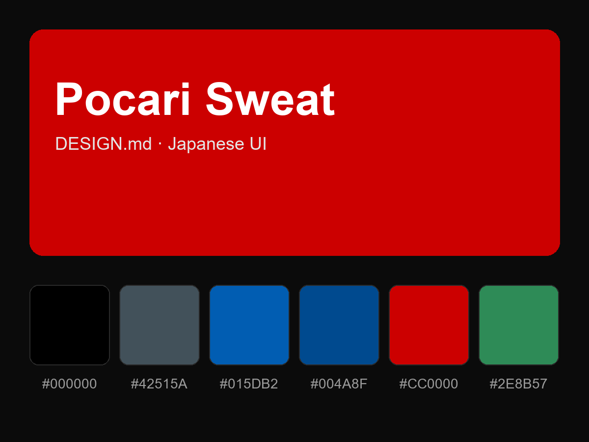
購入すると全文が表示されます