MIKIMOTO Style Design System (DESIGN.md, Japanese UI)
デザインシステム
Design approach: Expresses the luster and dignity of pearls through pure white negative space and a champagne gold #e5d3a9 CTA. A classic-luxury two-typeface system: serif (Noto Serif JP) for headings, sans-serif (Noto Sans Japanese) for body text - Density: Body line-height is an extremely generous 2.0. Rather than packing in information, it creates a sense of luxury through spacious breathing room - Keywords: luxury, pearl luster, champagne gold, serif headings, wide tracking, dignified negative space - Characteristics: - Follows the luxury-brand convention of serif for headings, sans-serif
メンバー限定
メンバー限定
アップグレードして解放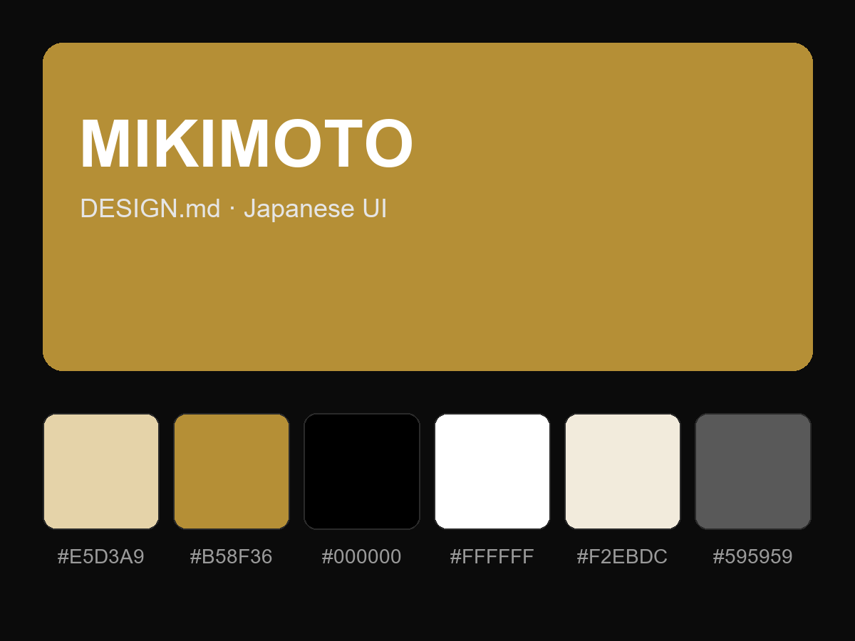
購入すると全文が表示されます