KAO Style Design System (DESIGN.md, Japanese UI)
デザインシステム
Design policy: The corporate site of a household products manufacturer representative of Japan. Centered on Kao Teal (#00806d), it expresses nature, cleanliness, and sustainability. As symbolized by its adoption of a UD (Universal Design) font, the design emphasizes accessibility and approachability - Density: Corporate-style portal. Brand information, sustainability, IR, and news are arranged in multiple layers. Rhythm is created by switching section backgrounds (white / warm gray #f6f6f4) - Keywords: Teal brand color, UD font, warm gray, natural, accessibility, sustainability - Characteristi
メンバー限定
メンバー限定
アップグレードして解放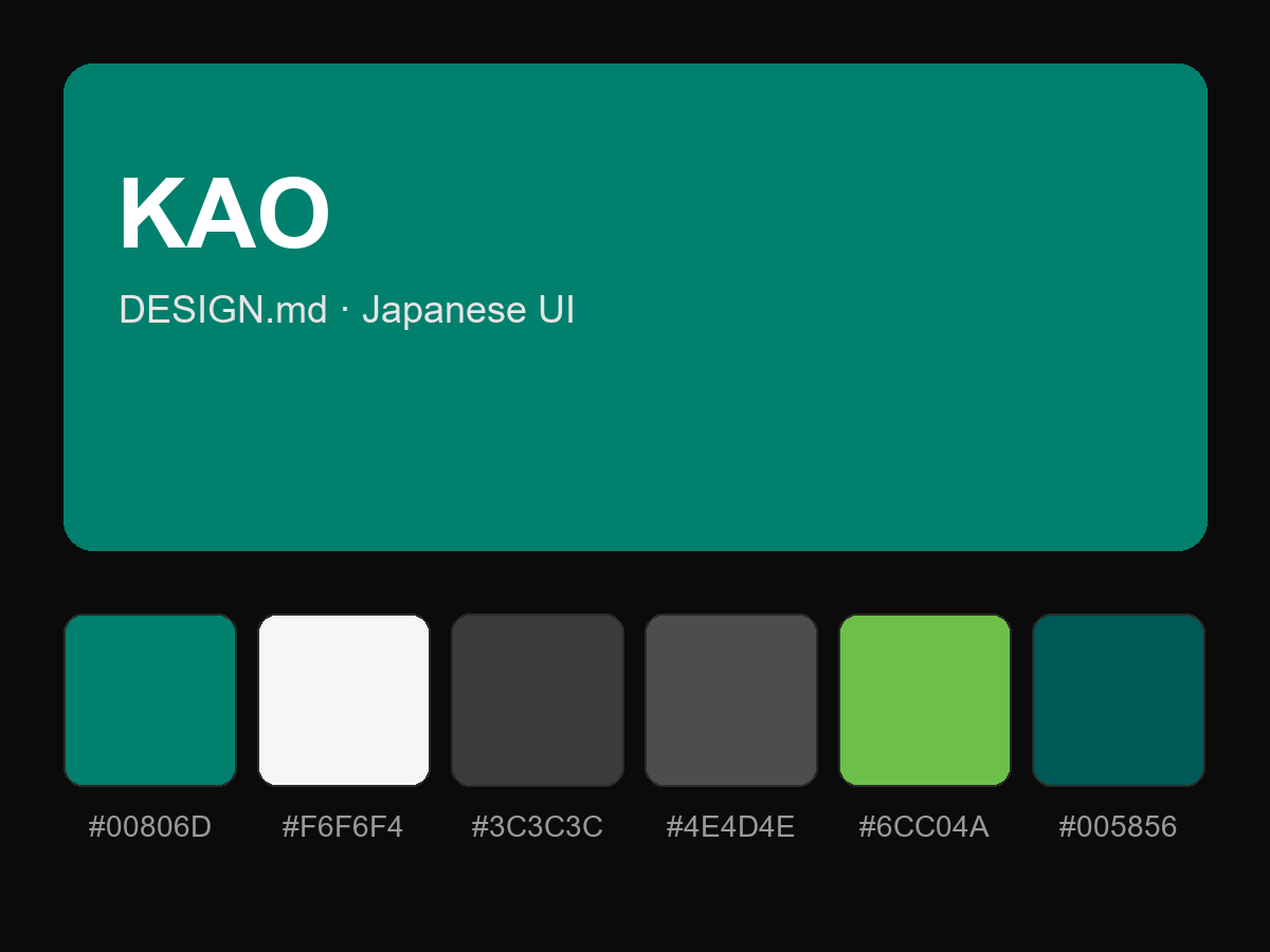
購入すると全文が表示されます