Ginza ITOYA Style Design System (DESIGN.md, Japanese UI)
デザインシステム
Design policy: A strong contrast between a dark header (#333333) and a light gray body (#f0f0f0) achieves both the prestige of a long-established store and a sense of cleanliness. The brand red #c70b17 is used sparingly as an accent color, maintaining the calm composure befitting a stationery store - Density: Body text at 18px / line-height 1.8 is on the larger side. A card-based product listing organizes content visually, with a browsing-oriented layout that uses generous whitespace - Keywords: Prestige of a long-established store, architectural straight lines (radius 0px), the intelligence o
メンバー限定
メンバー限定
アップグレードして解放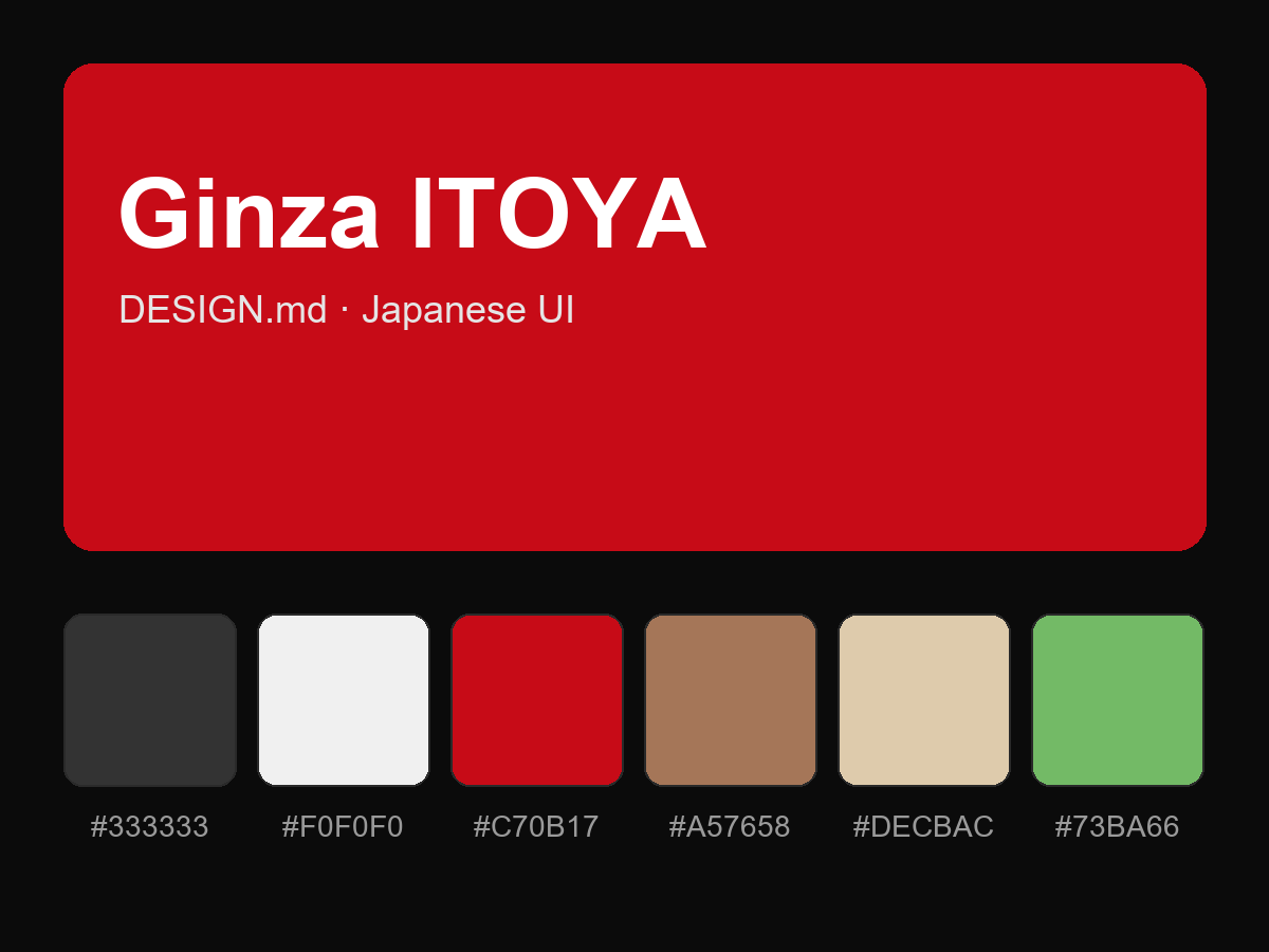
購入すると全文が表示されます