DAISO Style Design System (DESIGN.md, Japanese UI)
デザインシステム
Design approach: Expresses the pop, energetic excitement of a 100-yen shop. Uses vivid magenta pink as the brand color, putting the fun and approachability of variety goods front and center - Density: A corporate site that arranges information spaciously, with moderate whitespace and wide letter-spacing. Prioritizes brand clarity over the sheer variety of products - Keywords: pop, energetic, approachable, colorful, variety - Characteristics: The brand pink #f2157f is used across the board as text color, heading color, and link color. A flat design that barely uses shadows, achieving visual str
メンバー限定
メンバー限定
アップグレードして解放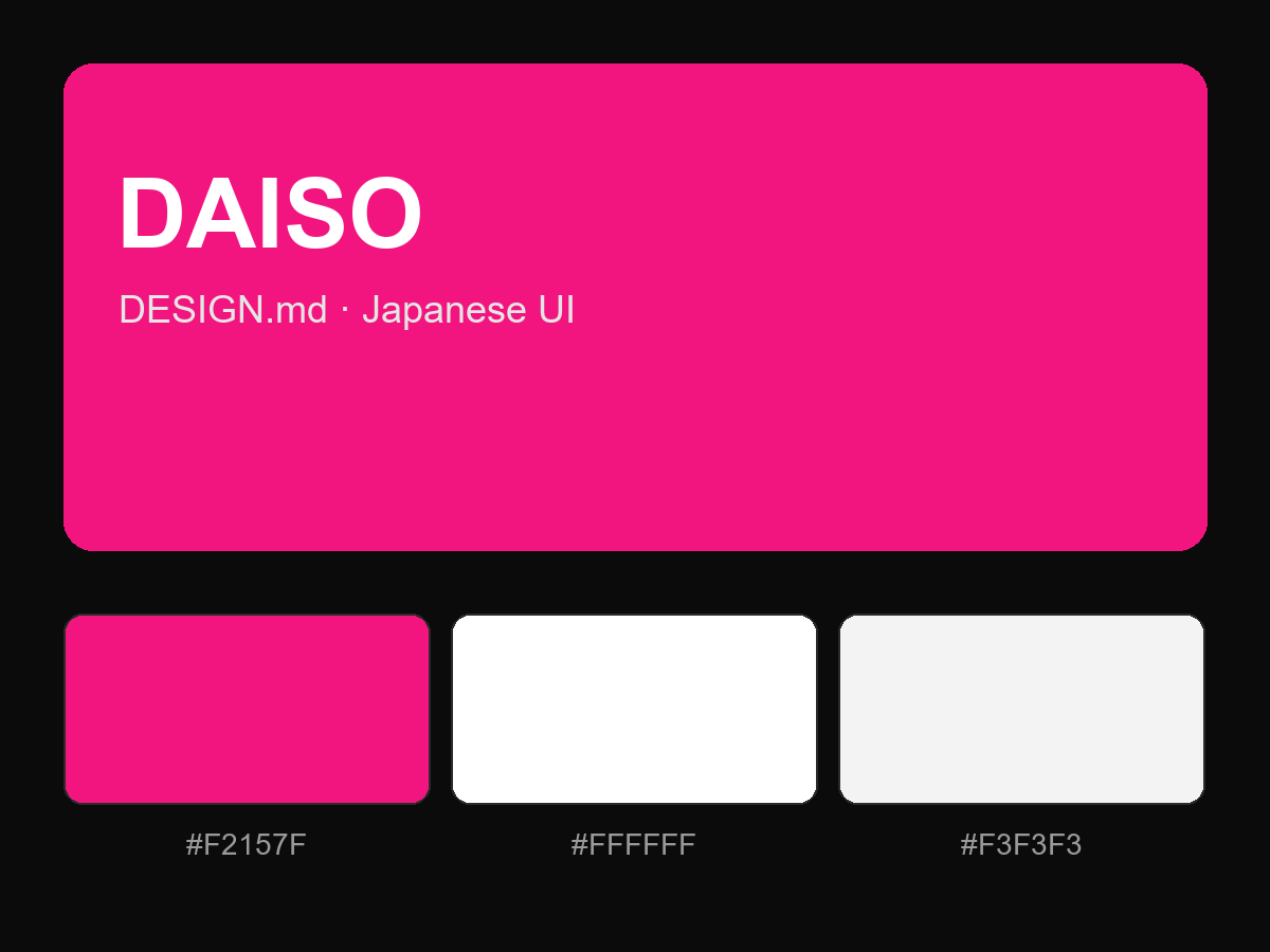
購入すると全文が表示されます