TENGA Style Design System (DESIGN.md, Japanese UI)
डिज़ाइन सिस्टम
Design approach: A clean, powerful product site built on a white ground (#ffffff) × black (#000000) foundation, using huge display type and product photography to express "love and freedom" directly. Ornamentation is stripped away, letting the sculptural beauty of the products themselves take center stage. - About TENGA: A company that redefined masturbation items as objects of industrial design and branding. The identity lies in the CUP series' red (standard), black, and white, and in the color-coding of each line. It communicates the message "Sex on the main street" in a bright, open tone. -
सिर्फ़ members के लिए
सिर्फ़ members के लिए
अनलॉक करने के लिए upgrade करें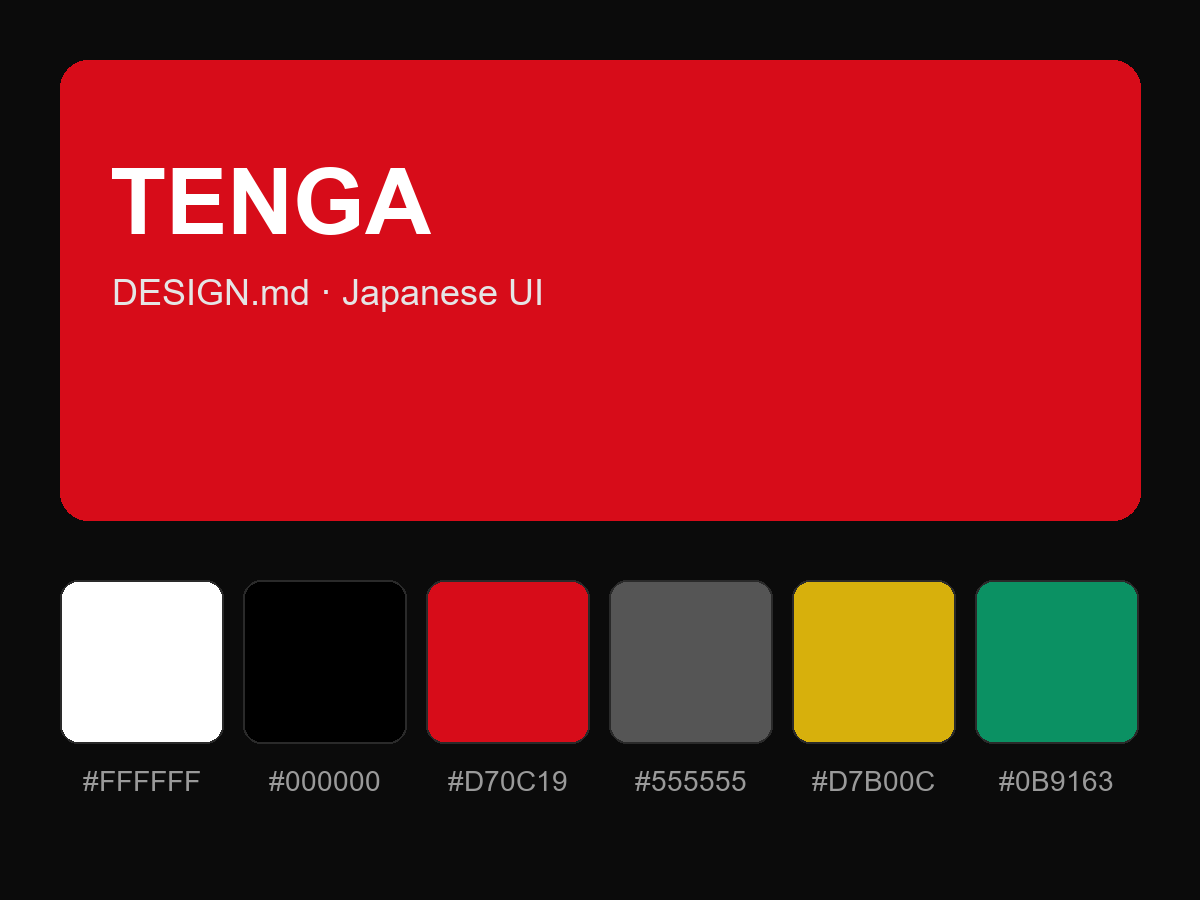
पूरा prompt देखने के लिए खरीदें