OMO by Hoshino Resorts (Omo) Style Design System (DESIGN.md, Japanese UI)
डिज़ाइन सिस्टम
Design policy: A bold, pop, playful dark design starring black background (#000000) × neon yellow (#fff778). Body text, headings, and lists are all yellow text, floating on the black canvas as if glowing. The concept "Excitement that gets you going, city play." is embodied through color - About OMO: Hoshino Resorts' urban hotel brand. Located "in the city center," where staff (OMO Rangers) guide guests to the charms of the neighborhood. It has a grade system from OMO1 to OMO7, and each property wears its own accent color. However, the brand's basic frame is unified in black × yellow - Density:
सिर्फ़ members के लिए
सिर्फ़ members के लिए
अनलॉक करने के लिए upgrade करें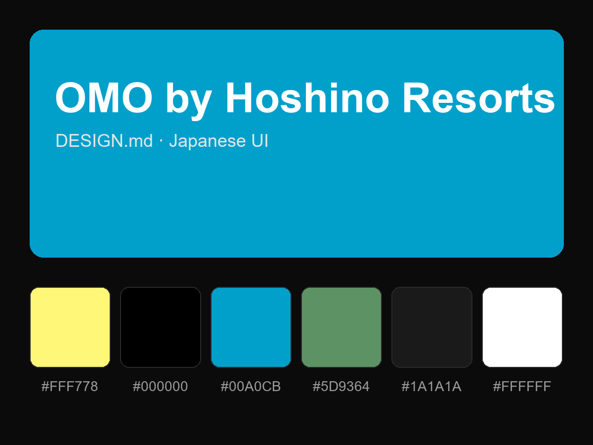
पूरा prompt देखने के लिए खरीदें