Hakuhodo Style Design System (DESIGN.md, Japanese UI)
डिज़ाइन सिस्टम
Design approach: A hybrid of editorial and corporate, built around the contrast between dark navy #1a1a23 and vivid red #ff1a1a. Generous whitespace and large Latin-script headings create the sense of "artistry" befitting an advertising agency - Density: Information density is on the low side. Large Latin typography of 42–80px is placed in the hero and section headings, while body text is kept compact at 14–16px. A magazine-like layout that invites reading - Keywords: editorial, vivid red, dark navy, two-typeface system (Japanese + Latin), the artistry of an advertising agency - Characteristic
सिर्फ़ members के लिए
सिर्फ़ members के लिए
अनलॉक करने के लिए upgrade करें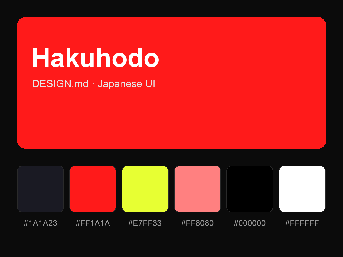
पूरा prompt देखने के लिए खरीदें